NS. There are two possible reactions to reading that. Someone who hasn't spent a lot of time in the Netherlands might say bless you, but a fellow Dutchie will get shivers down their spine.
For those who don't know, 'Nederlandse Spoorwegen' (also known as NS—kudos if you already figured that out) is the main railway operator in the Netherlands. While they operate train services and manage timetables, they share responsibilities with other entities: ProRail manages the actual rail infrastructure and stations, while regional operators handle some local lines.
What's far more interesting (to me) is that they also own and operate extensive IT infrastructure. While they do have some official public APIs, these require permission requests and expose only a limited subset of their data. Meanwhile, their internal tooling often ends up accessible on the public internet—sometimes without authentication requirements.
You can see where this is going. We're going to have some fun with data exfiltration!
Solving my personal pain points
Every project needs a goal. And the mission I set out for myself is to make my frequent and long commutes more efficient, or at least less cumbersome.
My main gripe with long journeys during peak hours is the inability to find a seat, or being forced to miss my transfer by some vacationers who (respectfully) don't have a fucking clue what they're doing.
Previously, I already made a private service for Efteling waiting times, which has collected two years of ride queue time history and weather conditions, and can predict waiting times decently well (thanks to a hotchpotch of Python, Pandas, Influx 2, and Grafana). Something like that, but for NS, would be amazing.
Think Buienradar-like prediction, but only slightly less terrible.
Now that's a joke that won't land at all for international readers. You're welcome.
The Hunt for Data
Before we can generate anything, we need input data. And what better way to get that than their own tooling? Unlikely to break (they haven't been updated in 5+ years), runs on their production service, and provides instant data.
Disclaimer: I know I'm not being a model web citizen here by poking around internal tools, but I'm keeping things ethical—no aggressive scraping, no overloading their servers, and I won't be sharing specific endpoints or methods to keep things clean.
My favorite entry point for NS data and APIs is their internal sign builder tool, which generates the digital displays you see in stations. While I won't share specifics about how to access it, I can tell you that it provides a fascinating window into their real-time data systems. The interface lets you configure new (local only) station displays, choose content layouts, and much more. The interesting part begins when you examine how it works under the hood—everything runs client-side, including their API integrations, all in readable, unminified JavaScript that essentially serves as live documentation!
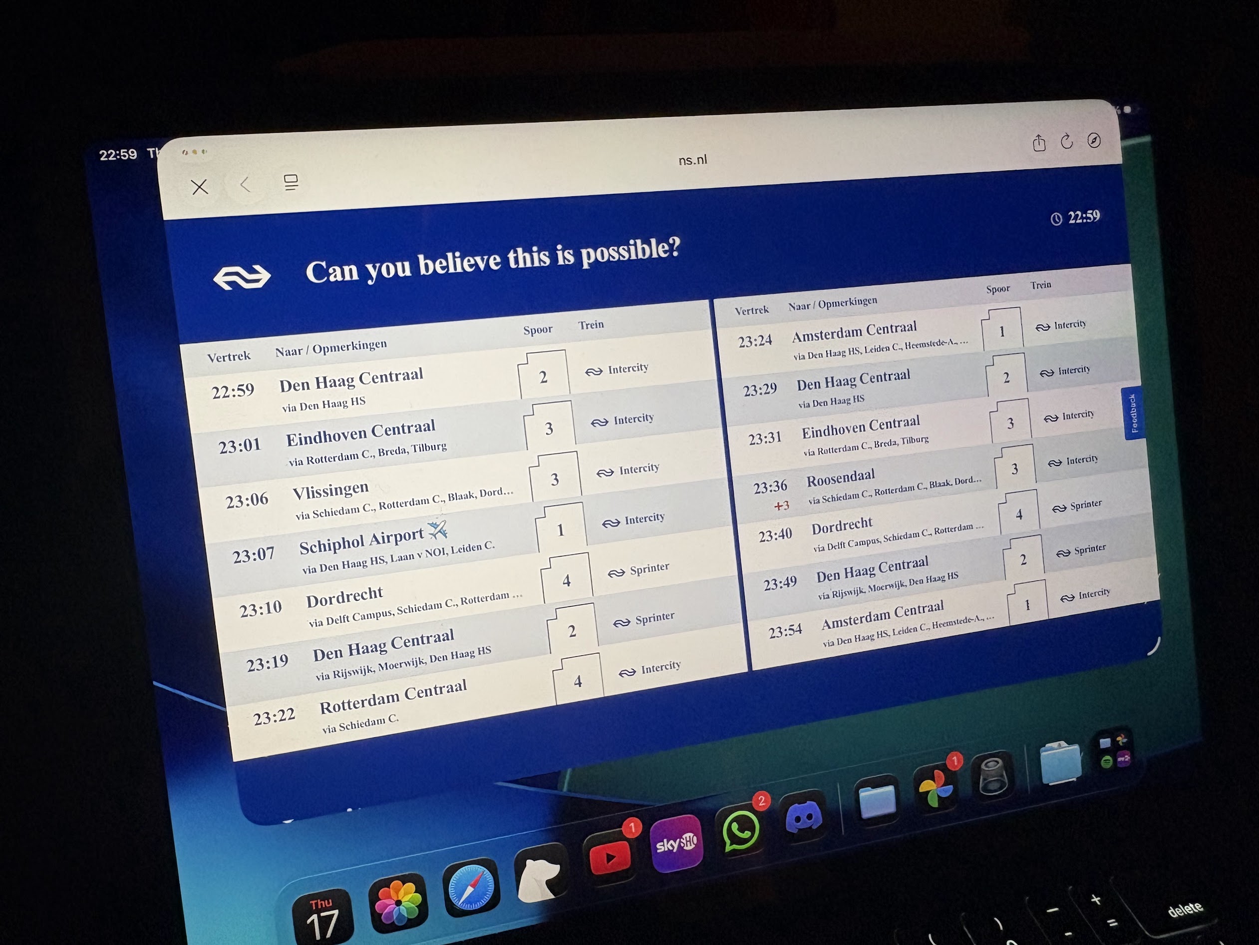
The data it's processing looks a lot like this:
{
  "departures": [
    {
      "direction": "Schiphol Airport ✈",
      "name": "NS  3589",
      "plannedDateTime": "2025-07-17T23:07:00+0200",
      "plannedTimeZoneOffset": 120,
      "actualDateTime": "2025-07-17T23:07:00+0200",
      "actualTimeZoneOffset": 120,
      "plannedTrack": "1",
      "actualTrack": "1",
      "product": {
        "number": "3589",
        "categoryCode": "IC",
        "shortCategoryName": "NS Intercity",
        "longCategoryName": "Intercity",
        "operatorName": "NS",
        "operatorCode": "NS",
        "type": "TRAIN"
      },
      "trainCategory": "IC",
      "cancelled": false,
      "routeStations": [
        {
          "uicCode": "8400280",
          "mediumName": "Den Haag HS"
        },
        {
          "uicCode": "8400380",
          "mediumName": "Laan v NOI"
        },
        {
          "uicCode": "8400390",
          "mediumName": "Leiden C."
        }
      ],
      "messages": [],
      "departureStatus": "ON_STATION"
    }
  ]
}
This gives us a treasure trove of information, which will be useful for future projects. But what we're most interested in right now is the product number, which is a unique ID for every currently in-use train.
If we do these requests for a handful of hub stations, process and remove duplicates, we end up with a reliable list of currently deployed hardware.
We can then take these IDs and use another API to ask for more specific details, like an estimated occupancy metric.
Sidenote: The way they do their occupancy estimation is actually really interesting. Though it's true that this data is crowdsourced to some extent, they primarily get the data from the train's weight, which is measured at various points.
Processing Data
Now, we've got a reliable method of reading real-time information. What's next?
Well, dear reader, it's once again time to spin the 🎰🎲✨WHEEL OF SUFFERING✨🎲🎰, where we'll be choosing our tech stack.
For this project, we'll need:
- a server-side environment to run the lovely crawling scripts
- a persistent database of some sort
- web hosting
And to run it RELIABLY, FAST, and for CHEAP (yeahhhh).
This naturally leads me to the Cloudflare stack, specifically:
- Workers for a cron-based compute environment, and to host the public REST API to serve data back to the web UI
- D1, an affordable SQL offering with generous free tiers
- Pages, their static site hosting that's competitive with Vercel
The worker is written in TypeScript and is responsible for calling all the external APIs and ingesting the data into D1. Workers are actually the perfect fit for this, because unlike competitors (like AWS Lambda), they only bill you for CPU duration, not request wall-clock time. This is great in our case, because our script will spend most of its time waiting on external API requests (time for which I will not be billed).
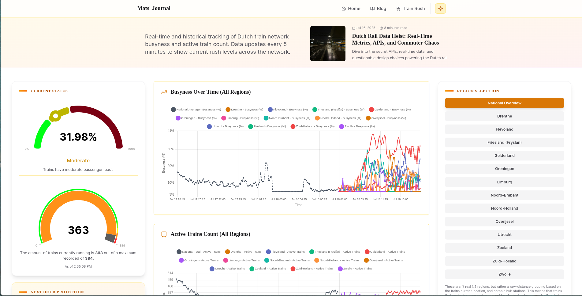
After our requests, we end up with four key metrics:
- the number of trains currently in service
- and how many of them are empty, well-filled, or busy
I want to have a single score/percentage which indicates the busyness across the network, which needs to adapt well to the number of trains in service. Such a formula is pretty easy to come up with, and I ended up with this:
function calculateBusynessPercentage(low: number, medium: number, high: number): number {
  const totalTrains = low + medium + high;
  if (totalTrains === 0) {
    return 0; // No trains, no business
  }

  // Calculate weighted score directly
  const weightedScore = (low * 1 + medium * 2 + high * 3);
  const maxPossibleScore = totalTrains * 3; // All trains at highest utilization

  // Normalize to 0-100 scale
  return (weightedScore / maxPossibleScore) * 100;
}
where low, medium, and high are all carriages sorted by their occupancy, totaling to the total service. Each value is weighted, and then normalized by the total amount.
This isn't perfect and leads to some weird temporary spikes when a lot of trains are taken into or out of service, but it's good enough for now.
I then store this data in D1 through a cron job and call it a day.
Yes, a time series database would be more appropriate for this use case, but D1's generous free tier and SQL familiarity make it a practical choice for this project's scale.
Those Who Hoard Data... Have a Lot to Sort Through
Those 288 data points per day are enough to do some fun stuff with. The web page I built for this project (in NextJS, though this part is rendered client-side) makes a request to my worker for the last 7 days' worth of data, and then visualizes it.
Then, for the real kicker, it tries to look at historical metrics from the same time frame in prior days and comes up with an educated guess of what the next hour will bring.
And thus I can finally make an educated guess if it's worth running for my train to ride before the wave of peak hours, or to ride it out and wait for things to cool down.
BONUS: Fun with Napkin Math
Since we have all this real-time data about train occupancy and network utilization, I thought it would be interesting to do some back-of-the-envelope calculations about revenue streams. This is purely for entertainment and educational purposes—think of it as a data science exercise rather than any serious financial analysis.
As a student who's acutely aware of travel costs (especially during summer months when the free travel doesn't apply), I was curious: what does all this passenger movement actually translate to in terms of revenue? The numbers are fascinating, even if they're built on assumptions and estimates.
We have real-time metrics, we know how big trains are, and we can make an educated guess about how many students and gate-hoppers there are at a given moment. And with that, we can also guess their real-time worth!
const avgSeatsPerTrain = 450; // Average seats per train (source: 600 Sprinter, and we'll deduct an arbitrary 25% for people who take up 2 seats)
const avgStandingCapacity = 300; // Standing room (source: my own estimate)
const totalCapacityPerTrain = avgSeatsPerTrain + avgStandingCapacity;

// Calculate current snapshot metrics
const totalCapacity = totalTrains * totalCapacityPerTrain;
const currentPassengers = Math.round((occupancyPercent / 100) * totalCapacity);

// Revenue calculations with more nuanced pricing
const avgTicketPrice = 7.80; // Based on my personal average
const studentDiscountRate = 0.4; // 40% discount for students
const nonPayingRate = 0.12; // (source: once again, freshly pulled from my own head)
const studentRate = 0.25; // 25% students (source: you'd never guess, my own estimate)

const payingFullPrice = Math.round(currentPassengers * (1 - nonPayingRate - studentRate));
const payingStudents = Math.round(currentPassengers * studentRate);
const nonPayingPassengers = Math.round(currentPassengers * nonPayingRate);

const fullPriceRevenue = payingFullPrice * avgTicketPrice;
const studentRevenue = payingStudents * avgTicketPrice * (1 - studentDiscountRate);
const totalRevenue = fullPriceRevenue + studentRevenue;
Not enough to make the costs hurt less, but a funny reminder that things are indeed messed up, and well on track to get even worse next year (hope you enjoy this excellent railway pun).
You can explore this data yourself on this page